Sunday, December 21, 2008

RGB light passes

Just a little thing about lighting/rendering/comping, based on what Josh Harvey and Eric Concepcion were doing for the Fusion Fall cinematic in the last post. This may be familiar to some people, but I hadn't seen it before in production, so I thought I'd give a little example. Josh was cool enough to explain it a few times to those of us who were interested and I think it's pretty cool.

The basic idea:
This is a really cool way to extend your flexibility in post-production. The concept is that rather than render RGB passes for the scene (or each light or whatever), you actually assign each light to a color channel and render each lighting pass with three individual light passes included. In essence, each light pass (render) will include one light in the red channel, one in the blue and one in the green. These are then used to reveal an ambient color pass of the scene based on each light channel. Let me show you with a simple example.

Example of RGB Light Passes (a simple version for clarity):
Let's say this is my scene. I'll do a simple 3 point light setup with a key light (directional), a fill (spot) and a rim (spot). I've added a bit of simple color to the character to make things more clear. Normally, I'd set up the lights, adjust their color and render a beauty pass (diffuse +/- spec, etc). maybe I'd add a shadow pass, amb occlusion, other passes, etc. But the idea would be that certainly the beauty pass would include all the lights. If I wanted to break out the lights for more control I would render a seperate RGBA pass for each light.
The idea here is a bit different. I'm leaving any light color info until post, so all I need to do is render the luminance (or diffuse/spec MINUS color) for each light. So I can use only one channel per light. It's a pretty easy setup actually. Only two passes (+ an amb occl pass, for fun)
First I'll take care of my color info. To do this I'll hide my three real lights and create an ambient light. You can do this from within the textures, by turning up the ambience, but I think it's much easier to turn off the ambience in the textures (you probly never had it on) and just make an ambient light. The only catch here is that the ambient light defaults to having an "ambient shade" value of 0.5, which sort of defeats the purpose. So turn that to 0.0 and make sure you've got no other lights on and render.


You'll get a pure color pass. Doesn't say much for my textures, but this is what I wanted.
This becomes the "base" for the lighting setup.


Now I'll take each light in turn and assign it's color to R, G, or B. My key light becomes pure red, fill pure green and rim pure blue.


Once each light is given a color, the render looks something like this. It seems very colorful, but really that's only because we've got a "false color" thing going on. The keylight isn't really pure red, it's just in the red channel to get it to post. Same with the other lights. (BTW, if you have more lights, you'd just do another pass with other lights in the RGB channels. You'd just do this whole process twice or more). Here's what the individual channels look like:

Now once we take it to post we can see why this method is actually pretty powerful.


Here I'm using Shake, just cause it's easier to see stuff and a bit less work/layers for comping. Could easily be done in After Effects or whatever. These are the only two layers I'm bringing for now (I'll bring in an AO pass later).


The trick is to seperate out the channels for each light and use THAT to matte out the color pass. So the light (from each channel) actually reveals the pure color, or doesn't. Basically making our own diffuse color pass. In Shake that's done with a "reorder", in After Effect it'd be a "shift channel", I think. (BTW, I'm sure there are few other ways to do this . . .)


You can see I created three reorders and pump the light pass into each one. Each channel gets shifted to red for the key, green for the fill, etc. Each one of those goes into a copy of the color pass as a mask (so it has the correct colors to reveal). So I end up with this node tree. (note: below the color passes are some "switch matte" nodes just to put the correct alpha channel back. I also added the Ambient Occlusion pass at the bottom of the tree)


To clarify each color pass looks like this when matted with the correct light channel.


Since we're just adding "light" to the scene, you can then just "add" each of these passes to each other to get the final fully lit image. (In After Effects or Photoshop, I'll just use transfer mode "add" to lay one on top of the other.) As I noted, I multiplied an occlusion pass at the end, also.

Finally, we can get to what's cool ab0ut this . . . Here's the image as it stands:


The power comes from my ability to now start adjusting each light/color pass. In Shake I just stick some nodes under each pass (in this case I just used a mult node to color each pass and fade node for the transparency of each pass):

By changing the transparency of each pass and the color of each pass you can end up with a huge array of options.


More theatrical?


More alien?


I changed all of that instantly, without any rerendering of anything. Notice that I've actually changed not only the color, but the intensity of each individual light on the fly. I could also change the gamma, etc for each light as I see fit, any color correction really.

This image is a bit dark and lo-res, etc, so it might not be the best example, but it shows the basic principles. There are lots of variations. You could do groups of lights per pass in a more complex scene, or render a FG pass, then add some subtle lighting effects to that with this method, etc. It's a great idea to render shadow passes this way by making the shadows from each light R, G, or B and seperating them in post. I wouldn't do this for everything, but for things where there's a more stylized look, I think the flexibility is invaluable. As I said, Josh and Eric rendered all of Fusion Fall this way.
Another bonus is the disc space it saves if you want this much control. Instead of an RGBA pass for each light you get three passes in one. I love the idea a reusing the channels for other things besides color. I'll do something later about RGB combo passes and ID mattes, etc. But that's enough tech stuff for now.

Sunday, December 14, 2008

Cartoon Network - Fusion Fall

One of the projects I worked on earlier in the year got posted recently, so I can show it. Eventually, I'll get this cut into my reel or on my real site, but the link will have to do for now.
Watch it here.
I got to meet lots of cool and talented people on this job: Josh Harvey, Nick Weigel, Stanley Ilin, Erol Gunduz, Roger An, Eric Concepcion, Ricardo Vicens, Dylan Maxwell, Ian Brauner, Jed, and all the cool peeps at Freestyle . . .
I did most of the rigging on it (all the human(oid) characters and the big green monster, plus some stuff on the bugs, the cars, etc). The most memorable thing about this job was that it was a psycho schedule and my daughter, Juliette, was born right smack dab in the middle of it (6 weeks early to boot). Since both she and the project turned out great, I have fond memories . . .

Some random Maya scripts

Sorry for a technical post, but thought it worth throwing these up here, if only so I could have them available wherever I'm working, in case I forget my drive ;)
BTW, I just threw these together while working to help myself out, make no claims as to their value to anyone else or my competence in putting them together. . .
zbw_playblast: (rt-click to dnload)
For when I'm animating. Nothing here that you can't do from the gui, just all in one place. buttons for toggling overscan, title/action safe and gate, renaming the playblast, changing the bkgrnd color, etc. When I was working on the Nickelodeon job (more later when it comes out), we had tons of things in the scene, so there's also a button to toggle on/off the curves/geo/other stuff.
zbw_groupOrient:(rt-click to dnload)
select the object/joint, then select the control for it and the script will create a group over the control, orient the group to the object, then rename the group to the control name + "_GRP". Useful for rigging.


zbw_changeColor: (rt_click to dnload)
Turns on the color override for selected objects and gives a slider to change color. Lets you do multiple objects at once, which is useful. Again, pretty much just for rigging.


I wrote a full body rigging script, which I'm still tweaking. That's a bit more complicated, so maybe I'll post something about that later.
UPDATE: Fixed links, sorry.

3D stock images

Been working with my Lovely, Talented, Smart and Lovely wife on a bunch of images to submit to a stock agency. Basically, just images based on globes. I can see why there aren't loads of 3D images in stock. They have to be rendered at around 6K (6,000 x 6,000 pixels). A lot of the ones we've been doing have depth of field, transparency and so forth, which takes FOREVER. About 3-5 hours per frame (I know that's not forever for some renders, but I'm doing 5 versions per image (US, S. Amer., Eur., Asia, Africa), each precomped on various colored backgrounds (15 images per concept). Some things don't work and some do (I rendered about 30 images at 4K, only to realize that wasn't high enough rez). I'm rendering them in little elements that Steph is then comping together. The upside is that with 30-40 pictures, we could probably get a couple hundred images through all the permutations. It just takes ages. Since I'm not a Render Ninja by any stretch, I'm trying to figure out the best way to attack these hi-res images as best I can.
Here are a couple, smallish, of course.

Wednesday, December 10, 2008

Nil doodle - animated

Just playing around for a few minutes in Flash. Don't know how anyone ever used Flash or Photoshop without a Wacom pen/tablet (I did for years). Absolutely different programs when you can draw kind of properly.
Anyways, as I said, I was doodling in Flash and started playing with a character that Rich and I were discussing the other day, Nil. We were talking about his head shape and translating it to 3D and I just started drawing him (not nearly as well as Richard does). Anyhoo, the resulting test is below. It was fun to draw something again, even just for 20 minutes. BTW, it was 12 fps drawn on two layers (head, arms). Hopefully more about the real Nil project later.


click pic to play the .gif

Oh yeah, also wanted to mention that I've been reading Ken Perlin's blog and put a link on the right side (over there --->). I've worked briefly with Ken on a project and he's near about the smartest computer-y type guy out there. But he's also a really fun blog writer ("blogger", I guess) about a lot of different topics, most of which require no p.h.d. so I'm throwing it out there.

Tuesday, December 02, 2008

Sure I'll work on your movie. Where's my trailer?

Rich and I got some work animating a few sequences for a movie some friends are making!
The Brothers Barnes shot a documentary about Todd Snider, called "Peace Queer: The Movie" and had a few interstitial moments they wanted to fill. They called me about some animation. The schedule was basically 3 minutes in less than 2 weeks to make their deadline for the South by Southwest festival. Yikes. So after throwing up in my mouth a little bit, I said the only thing I think I could do would be something along the lines of Ilksville. I showed then what we had done and Viola! They liked the style and I whipped up some storyboards and now Rich and I are furiously making the characters, backgrounds and animating away. When it's all said and done, I'll post some stuff up. It's basically just some Ilksville-ish charicatures of the subjects of the movie that Rich drew up, with the same rigging and animation procedures and such as I've mentioned here before. The only new thing is that there are some cuts to tell the stories a bit better.

It's a lot of work (relatively) in a short amount of time, but it's fun. I love working with the Barnes. Worked with them on some jobs for IBM/Lenovo and always like their stuff. Good to be back working with them again. So never let anyone tell you blogging doesn't pay off!
I won't forget my roots when I become big and famous. I bet Rich will. . .

Sunday, November 23, 2008

Needful Head DVD

Rich made this up the other day. I guess that means we're making the Special Edition DVD!
It will include the Director's Cut (which, since I am the director AND the producer, will be the exact same as any other version), loads of needless commentary, a Makin'-Of Featurette that is in the makin', a read-along version of the Book with a neat-o "linky thingy" that will let you play the scene from the movie that corresponds to the scene from the book (I need to work on the marketing pitch for that particular feature. . . ) and perhaps some other things that you might like. Or not. What do I care? We're not offering refunds.
So if you're interested in acquiring a few copies of the DVD, let me know. The minimum order is 32. Cuz my economy needz stimulatin. . .
BTW, the trailer is here.

Fishes doodle


Just doodling . . .
Guess which one I am? (hint: second from the left. Workin my way up the food chain baby!)

Monday, November 03, 2008

I'm back, baby!

Been working on an Undisclosed Job in an Undisclosed Location (actually at home) for the past few weeks. Can't show or tell anything about it (for a year!?), but I dug up something for the pitch that I never showed the client. Rich and I were thumbing through "The Art of the Matrix" book the other day (Rich is working on a graphic novel, which is also undisclosed, etc etc) and this thing I did a few years ago reminded vaguely and worsely (?) of Geof Darrow. (BTW, shockingly hard to find his art online). So I'm putting it here. How's that for an explanation?


(click for larger)

Wednesday, October 08, 2008

Technical - Modeling Psychemy

Richard has a series of drawings that I love that are called, collectively, Psychemy. He's had some of these up in art galleries on both coasts and keeps adding new pics into the collection. It's basically a loose series of weird little mis-en-scenes or scenarios. We've talked a bit about working these into short little animations. They're really weird and fun and moody and full of character. Since Ilksville is so cheap and we're working on a slightly longer form piece with a big story(more later), I think any Psychemy stuff will be, instead, about style and execution, really hitting a mood and a look. So anyways I'm slowly getting started working on some pieces for these projects (I have two of these Psychemy shorts in mind right now, this is from one of them).

So anyways this fella is from one pic (I've cropped the rest of the image out so as not to give away any story).
I thought I would just quicky post about starting to model out this character. Any crits comments welcome . . .
Today . . . the head.
So. . . I just started modeling yesterday. I think the idea will be to go pretty realistic and tone it down from there if necessary. So I'll just show some shots of where I am and how I got there.

(click any pic for larger)


So basically, I start with a unit cube and move it 0.5 units in x til the edge lines up with the origin. Then I delete the origin-side face so I have a box with the open side facing the origin. I center the pivot on the origin and then use the poly proxy to duplicate the object and set up vis layers. (Back in the day, I used Connect Poly Shape to do this. It's built into Maya now). So basically I'm modeling the entire head on only one side and the poly proxy ends up duplicating the other side. I can smooth that or leave it rough modeled, hide or show any version of this. All these visibilities are useful depending on the stage. Here's after ten minutes or so of getting the rough shape. It's important to make sure you really pay attention to each vertex you add, moving it to enhance the shape.

Here's with a few more loops added. I'm basically just adding loops at this point and shaping the head each time. You can see for the eyes, I'm starting to add the shape of the loops. I'll have three major sets of edge loops: 2 eyes and the mouth. The nose kind of works off all three. BTW, I'm NOT a great modeler, but I try to make sense of it as I go, so bear with me if you know a better way (and be sure to tell me anything to improve my sh#t). I just added the eyes by cutting (chamfering?) the vertex where the eye will be.


Here's what I was talking ab0ut with the proxy stuff. I often model only on half the face, then periodically look and see what it looks like whole and smoothed. you can see the starts of the loops for the eyes and mouth. There are definitely some problems at this point. The laugh line isn't really right (look in the mirror, it goes up onto your nose) and the mouth loops are a bit wonky. Even on simplified or non-real characters I thinks it's pretty huge to have the topology at least close so the deformations when you animate work well. As I said I'm not a great modeler, but having an idea helps. So I'll usually stop at a point like this and rework some of that stuff, adding edges and deleting them til it works a bit better.

So here's where I've ended up at this point. I've added a few more loops around the eye and ended up turning the chin inwards, making it much "weaker". I've added some really rough ears, too.
At this point I only have half a head. I'll leave it that way til I'm really sure it's right. This character is pretty asymetric so I have a bit of a dilema. The two options are to just create a symetric model, which is much easier to work with and rig (especially if you have any heavy rigging stuff you want to dupe from side to side). Then I'd model the asymetry and use it as "permanent" blend shape later. Or I could just finalize the model and "hard model" in the asymetrical changes. I'll do that for now just for testing. (it took about 5 hours to get to this point.)

Here is the smoothed poly proxy. I'll just copy the scene and get rid of the stuff I don't need. BTW, I save a new version about every 10 minutes. I have about 15 versions of just the head. I've used the autosave version stuff and it's fine, but I don't always trust Maya, so I manually "save as".


I'm not going crazy with this, since I'm going to go back and tweak the ears and a few other things, but I just wanted to do a test to make sure the asymetry worked OK. It pretty much does. I'm back to low-poly merged version (acutally an older version, sorry) and I pretty much just used some soft mods (about 10) and pulled points. A couple of quick tweaks to line up some verts and this is what I got. Not quite there, but close enough for now. (some loops need some work, but I'll redo all this later)


Here's a smoother version. Obviously I'll have to make some changes. There's still way too much symetry and things a bit too "normal". I like to pull out renders (or screencaps) to look at stuff so I can judge things as from the third person perspective. I'll make notes and go back later and make things works better.


So aside from adding an inside of the mouth/teeth and "lumping" things up generally, here are some things I'll change when I get a chance to go back to the model. Having worked with Richard's illustrations before I know that I always have to go back and add in "quirkiness" later. The model might look fine (or might not), but it needs to match his mood, which is really unique and great, so I think it's worth the time to pull around a few pixels to get it right.

Hopefully, I'll have some time soon to go back and polish this up. I think the body should be pretty easy, so I should do that in a day or two also and post it when I'm done. I'm still trying to figure out whether to go nuts with the hair and clothes, or keep it easy. We'll see.

Friday, September 19, 2008

Ilksville - "fasting" testing

So here's another one I worked on for 5-6 hours yesterday and today. The sound is a bit low on this one for much of it (I may have to treat it to make it more clear) and it is, once again, about as long as I would want to go, but it's progressing. As always, this is audio of an actual conversation . . .


As I said previously, I'm not trying to make these any good from an animation POV, just sort of fun little things to watch. But one thing I'm finding interesting is that these require attention to a sort of secondary animation principle that I usually don't worry about too much. Because these are so static and there is so much reliance on the eyes and mouths, I find that it's really important to make sure that I'm at least doing a little to direct the viewer's eye to where it needs to be. I have to be really careful not to put extraneous motion away from the center of action. Subtle things seem to work OK to give some texture, but big movements will pull the eye all the way across the scene and make it harder to watch. Obviously, this isn't animation rocket science, but I though it was interesting that certain things become more clear when something is as simple as this. It's also a little more clear in the larger version (see link below) . . .

view the larger QT - here

Tuesday, September 16, 2008

Animation - The Needful Head Website/Trailer

Just for anyone that I haven't told yet, I made a site for "The Needful Head". It's not quite done (slouching my way to the finish line . . . ) but it Exists, and that's the important part.
I can't put the full film up there (it's still at fests around, just played in Taipei and in Germany in a couple of weeks and is scheduled to go onto iTunes soon), but there are pics and stuff there and some drawings from the book that Rich wrote and illustrated that aren't in the movie. The music is a bit annoying (Halli's music is wonderful, but unstoppable on the site at this point). I also slapped a trailer together, which is on the site. The link to the site is on the the right side, over there =====>>>
or www.TheNeedfulHead.com

Here's the trailer.

Animation - noise and BofA animation WIP

I just found this "laying" around my hard drive. Kind of apropos, given the current banking crisis. . . It's from a job at a studio, which I won't name, that never amounted to much (this job, not the studio). I don't think it was ever finished (parts are even still in blocking). I had about a week or so to rig the character, plan, block and animate this little spot (obviously it's not a real render and minus any 2d text, logos, etc). It was proof of concept thingy. The people were nice, but the job wasn't much fun. I'm pretty sure nothing came of it (I spent some time later at Framestore and they did most of the B of A spots I've seen on TV, though I didn't work on them). I'm starting to gather my stuff from the last year to put on a new reel and came across this. There are some problems (the foot slipping at the beginning sucks), but there are bits that were OK, at least in theory.

The reason I remember this so well is that while I was working on this, there was no soundtrack for the spot yet. The studio I was working at played REALLY loud music. I never listen to music while I work, especially while I animate, so that was distracting, but the kicker was they wanted a really specific look to the drumming (don't know if I ever got it, or even if this is the last pass I did). So I was trying to work out the animation to a specific drum beat that didn't exist while listening to BLASTING techno! I nearly had a nervous breakdown. Live and learn. Now I go to studios with headphones, put them on and just listen to nothing. . . .


click here to see a slightly larger QT version - BofA animation QT

Technical - Figuring out Linear Workflow in Maya

Another techy thing. Just learning about this stuff and wanted to throw some stuff up about it. This is specifically Maya related (more specifically Mental Ray).
This is called Linear Workflow . . . I'll give you the most simple version (and hope that I don't get that too wrong).
Basically, the gist is this. When you're working in Maya (or most other 3d apps), the math that makes the images works in something called "linear" space. Okay . . . The problem comes from the fact that the images you're used to looking at generally come "corrected" or "adjusted", NOT in "linear" space. This is to compensate for the way computer monitors and tvs treat light vs. the way your eye see light. You've probably seen this idea either in calibrating your monitor or in a Photoshop image that's missing some info. The common space for monitor's correction is called sRBG (again you may have seen this term somewhere on your computer). Digital cameras and web photos, etc are usually all gamma corrected to sRGB (a value of 2.2), so they look correct to your eye. This gamma is basically the relationship of lights to darks (it's the center point slider in the levels control of photoshop). Correcting gamma to sRGB looks like it makes the image lighter, but it's actually more complex. It's really changing the gradient from dark to light. The blacks are still black and the whites are still white, but the stuff in the middle shifts brighter (sRGB or gamma 2.2) or darker (linear or gamma 1.0) to the eye. This comes into to play mostly when you're trying to render realistic images in a 3D program. Things don't work quite right.
So here's the basic, simplified deal (I'll show an example in one second).
  1. the program works and renders linear images (hence "linear workflow")
  2. to look correct, images must be gamma corrected
  3. therefore, you should be gamma correcting your output images when you render in 3d
An example/cheap and easy tutorial in Maya/Mental Ray:
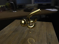
I set up a scene with a few objects, each with an mia material and create an HDR environment. Here's what I get straight out of the box:

(click images for larger)
This is supposed to be correct, but when compared with what I think it should look like (based on the HDRI file), it's DARK.
Typically, one would just crank up the influence of the env HDRI or add some lights. But you shouldn't have to . . . that's the problem. Furthermore, the image is actually only too dark in the darker parts. That's because this image is LINEAR, and thus looks funny on your monitor. There is only one element of this image that actually matches what one would expect. That's the wooden floor. That's because this TIF file has already been gamma encoded (I know because it looks right in Preview, as I said most normal images are already gamma encoded). So Maya takes what you give it and computes and renders out in linear(dark) space.
To properly light and render this image, there are two steps (at it's most basic level):
  1. I'll de-gamma my textures. This will make EVERYTHING in plain old linear space up until we hit the camera.
  2. Then I'll add a gamma correction to the camera lens. Everything that then renders will be properly gamma corrected.
When we do it this way, we know that all elements are working properly and synchronistically in linear space (this is for the math and computations). Then we correct the final image right before we see it, so that it looks "correct". This should create an image that is less contrasty looking, with less "blown out" areas and fewer crunched shadow areas.
Here's how I fixed the image above.
The first step is to "de-gamma" my texture file (the wood). Here's how. You should stick a Gamma Correct node in between the texture file and the material. Then connect the outColor of the image into the value of the Gamma Correct. Then change the "gamma" value of the correct node to 0.455 in all channels. This is to "de-gamma" the image (.45 is the inverse of the sRGB gamma, i.e. 1/2.2). Don't worry too much. 2.2 and 0.455 are really the only two numbers you need to know.

Repeat this step on every texture file you have. (there are other approaches, but this is the simplest.)
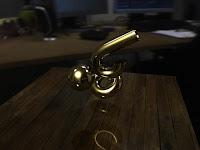
This is the image that you get now:

You'll notice that the only real difference is that the wood is actually darker. That was exactly the point. We want everything on the same page, the same working color space, in this case, linear. The image was looking dark and now the wood is equally as dark, because we removed the gamma correction that was built into the texture. Now we can add correction back (to sRGB) and the wood texture won't be brighter than the rest of the image. Got it?
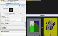
Now let's add that correction back, this time onto the camera itself. Select the render cam and open it's attribute editor. Twirl down the "mental ray" tab and we're looking for the "lens shader" slot.

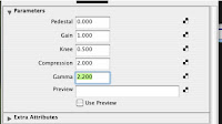
Click on the checker box of the "lens shader" slot and add (from the MR list) an mia_exposure_simple node (you could also use the photographic version of the exposure, but simple works fine for now). Open it's attributes and change the gamma to 2.2. (some people seem to like the look of 1.8 better, but that's a seperate issue). This is correcting to sRGB (the way you normally see images).

So anything this camera renders will get a gamma of 2.2 added (which is why we had to remove the gamma from the texture file, otherwise we'd double it up). Since everything in our scene has been working in linear space, the image should look much more like one would expect a photograph of our scene to look.
Here's the image with gamma correction.

The image is much "brighter" and softer. The brightness is actually all in the midtones. The white parts and the black parts are all the same, just the gamma has changed. Adding the sRGB gamma makes the physical properties of the image behave much more like a photograph to our eyes, which was the point. The wood is now in line with the rest of the image, as well, unlike our first pass. And I never touched a light or any other setting save the gammas!
So in short, there are two things to do for the basics:
1. remove gamma corrections from your texture files
2. add gamma correction to your camera for the renders.

whew.

NOTE: These images were rendered in preview quality and took about 5 seconds each. There was no retouching or anything at all.
One could easily work in this mode then remove the gamma (switch the gamma back to 1.0) and render to float images for later gamma correcting in a comping program, or use different workflows entirely, but this was the easiest way for me to understand this.

NEW NOTE (thanks andrew, from 3dlight): You can also adjust the gamma at the framebuffer in mental ray render globals, but this works inversely (to add gamma of 2.2 (make the image lighter), you would have to change the setting to 0.455). In that case, you would not need to add all of the gamma correct nodes to your textures, it would correct those all for you, but you would need to turn your lens shader gamma back to 1.0. There is some difference in terms of what happens depending on whether your textures and/or output are float or LDR, but I'll leave that be for now. You can certainly get better info on that from the links below.

Some good posts for more about this stuff are:
http://3dlight.blogspot.com/2008/09/linear-workflow-for-maya-mental-ray.html
http://www.djx.com.au/blog/2008/09/13/linear-workflow-and-gamma/
http://www.floze.org/2008/07/six-tuts-on-light-and-shade-part-i.html

Monday, September 15, 2008

Technical - Making Ilksville

Yes, there will be technical stuff here. I'll try to give fair warning (like the word "technical" in the heading). But since I enjoy knowing how other people do stuff, I figured I may as well show I do stuff.
Here I'm gonna walk through the basics of how we put Ilksville together. Here's where we started . . .

Audio is recorded on a little device (a Zoom H2, it's awesome. records in surround sound if you want! It's cheap and small and works like a charm). Just stuff with our friends for now, but we'll branch out and record other people and things as we go. We take that "wild" sound and listen to it and clip out a few interesting little snippets. I run those through Soundtrack pro and 2 semi-tones up of pitch correction to each. I take these snippets and we figure out which to use and then pick a character for each person (if they don't already have one) from the many pages of characters Rich has done and start to set them up . (BTW, I think this is basically how South Park is animated . . .)

This is one of the dozen of so pages of chars Rich started with. The character for Rich is third from the left on the bottom row.


(click pics for larger)


Then Rich redrew the character so I could put it back together as individual pieces.
I used the original template to piece this back together in seperate layers in Photoshop. Then I rendered each piece out in its own Tif file.


The next step is to go into Maya (3D program) and create a flat plane for each body part. I map the textures onto the planes. Here's a quick example.
Each plane is positioned and the pivots, etc are adjusted so the parts move as they should when rotated. Basically, every thing will rotate in only one plane. If we wanted to create a new arm shape we would draw a new arm and map that onto the flat plane. We're trying to stay away from that for now. Just keep it super simple.

Then I add in controls for each body part and link them as I would any character (parenting, point, orient and parent constraints) I try to lock off anything that won't be used so I don't confuse myself when animating. The only parts that are slightly different are the mouth and eyes. That's because these have so many shapes.


For instance you can see here that the mouth has some new controls. I set up some enum controls on the mouth controller with each phoneme. This type of control works well because each shape will completely cancel the previous shape.
I tried to use the bare minimum of shapes, as you can see. I then used set driven keys to drive the visibilities of the various mouth shapes (easier to me than switching textures).
The eyes were similar.
Each mouth shape and eye shape was drawn seperately in photoshop then imported and mapped onto a plane. Again there's probly an easier way to do this, but I couldnt' be bothered . . .

BTW, I copy each rig from a previous character and reshape it for the next one. Then I reproject the UV's and change the texture maps, so I don't start from scratch on each one. . .
In terms of the backgrounds we're just using anything that seems to work. In this case I took a photo at the Museum of Natural History and tweaked it out. Sorry kid. Whoever you are.


The first pic is the orig. The second pic is the corrected one.
I use these in Maya to layout the scene, but don't render them. I only render the chars and props then comp it all in after effects, adding shadows, etc.
So here are the characters in the set. Everything is done from the front view, so there is no perspective at all. Everything is orthagonally flat.
Since the set won't be rendered with the chars, I don't need to complete all the doodads before I render. I can go back and add in signs or whatever later.
Then I just start moving things around. I do the mouths first. Then just do runs on the body. I'll do the torso, then the arms, etc. Sometimes I'll animate straight ahead for a little while too. This one ("purses") was really long. It took about one day. "swayze" only took about 2 hours. I'm trying to animate as LITTLE as possible and still have it be watchable. I'll have to adjust the level of animation once I do a few more and figure out what works best. Trying not to be fussy at all. Bush-league, I know, but time is precious and stress sucks. The red hashes at the bottom are all hand animated points, so you get an idea of how many things need to be touched even for this level of animation.The timeline covers about 1 minute. Even keeping it simple, it's a lot of animation to do in a day.
That's about it. As I said I render it out and comp it together with the final pic in after effects and mix the sound back in. Eventually I'll also be adding a quick title and end card to each one as well.